THE DETAILS
Piaf is a combination of good design, quality code and attention for details.
We used same design language for components, layouts, apps and other parts of the themes.
Hope you enjoy it!
Right Click Menu
Increases overall usability of the project by providing additional actions menu.
Keyboard Shortcuts
Easily configurable keyboard shortcuts plugin that highly improves user experience.
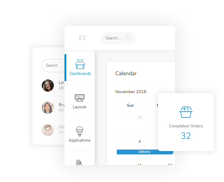
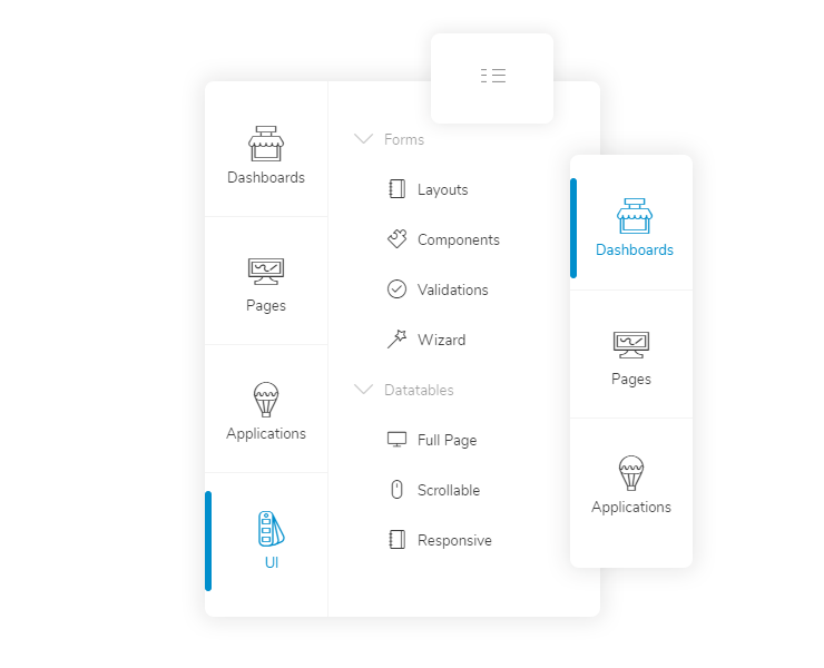
Two Panels Menu
Three states two panels icon menu that looks good, auto resizes and does the job well.
Icons Mind (Save $79)
1040 icons in 53 different categories, designed pixel perfect and ready for your project.
10 Color Schemes
Colors, icons and design harmony that creates excellent themes to cover entire project.
3 Applications
Applications that mostly made of components are the way to get started to create something similar.
Extra Responsive
Custom Bootstrap 4 xxs & xxl classes delivers better experiences for smaller and larger screens.
Features At a Glance
We tried to create an admin theme that we would like to use ourselves so we listed our priorities. We would like to have a theme that is not over complicated to use, does the job well, contains must have components and looks really nice.
Pleasant Design
As a web developer we enjoy to work on something looks nice. It is not an absolute necessity but it really motivates us that final product will look good for user point of view.
So we put a lot of work into colors, icons, composition and design harmony. Themed components and layouts with same design language.
We kept user experience principles always at the heart of the design process.
Extra Responsive
Xxs breakpoint is for smaller screens that has a resolution lower than 420px. Xs works between 576px and 420px. Xxl breakpoint is for larger screens that has a resolution higher than 1440px. Xl works between 1200px and 1440px.
With this approach we were able to create better experiences for smaller and larger screens.
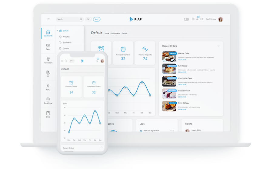
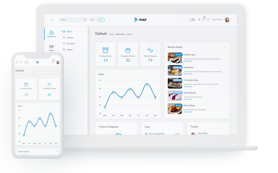
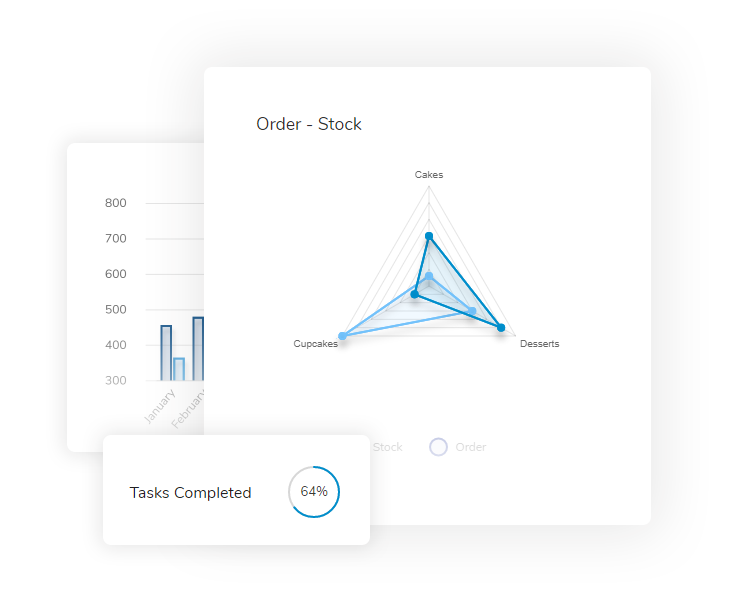
Superfine Charts
Using charts is a good way to visualize data but they often look ugly and break the rhythm of design.
We concentrated on a single chart library and tried to create charts that look good with color, opacity, border and shadow.
Used certain plugins and created some to make charts even more useful and beautiful.
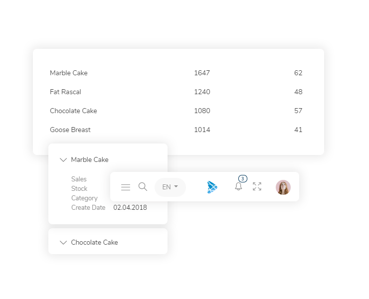
Layouts for the Job
Layouts are the real thing, they need to be accurate and right for the job. They should be functional for both user and developer.
We created lots of different layouts for different jobs.
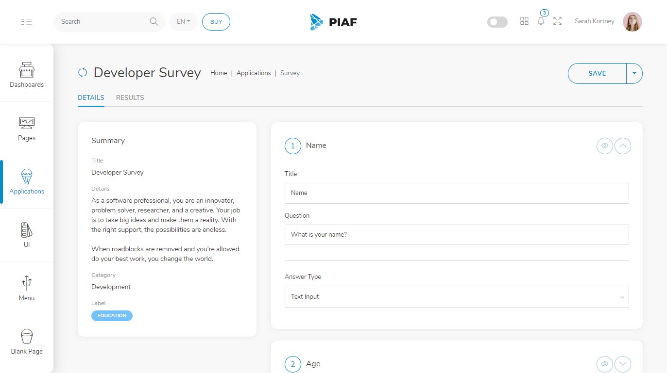
Listing pages with view mode changing capabilities, shift select and select all functionality, application layouts with an additional menu, authentication and error layouts which has a different design than the other pages were our main focus. We also created details page with tabs that can hold many components.
Smart Menu
Instead of good old single panel menus with accordion structure that looks over complicated, we created 2 panels and categorized pages accordingly.
The default menu auto hides sub panel when resolution is under some breakpoint to open some space. You may also hide menu completely or use only main panel open only.
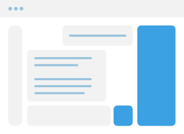
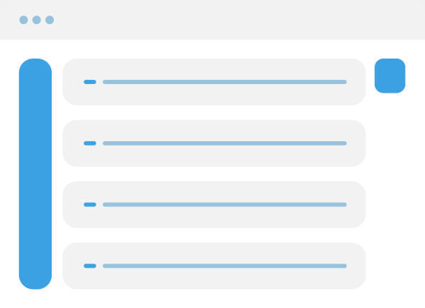
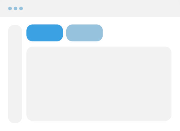
Structures & Layouts
We did our best to create layouts for various needs that developers might have and best experience for users.
They are clean and slick. They function well and look good at the same time.
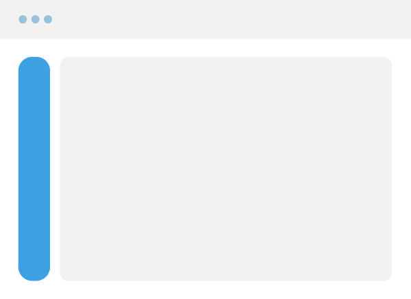
Menu Default
Menu Subhidden
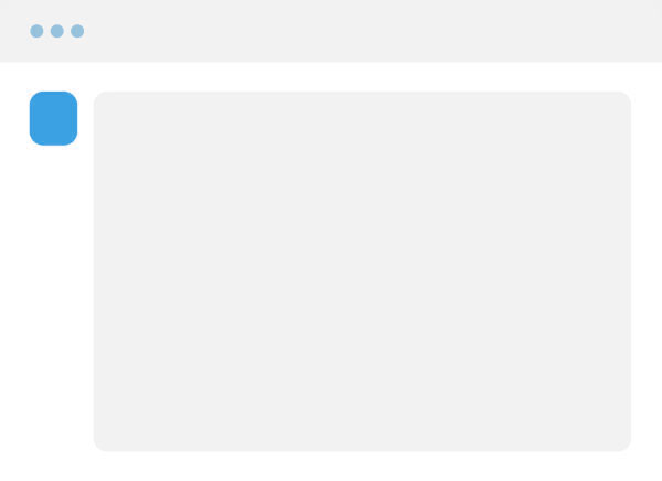
Menu Hidden
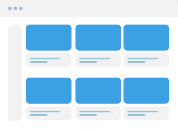
Image List
Thumb List
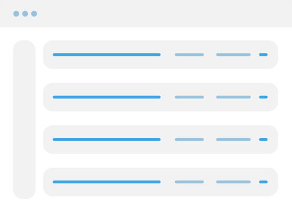
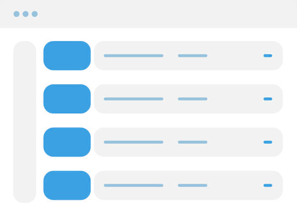
Data List
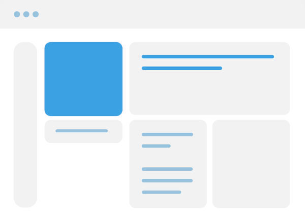
Details
Authentication
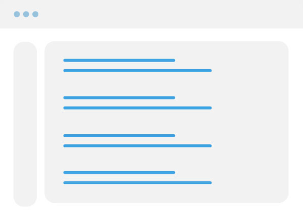
Search Results
Single Page Application
Data List App Menu Hidden
Tabs
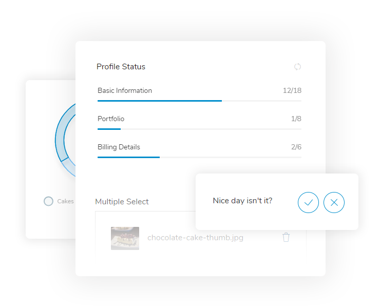
Components
We used most popular and well managed open source components with bootstrap components. Combined them into even more useful ones. Themed them with same design principles and created a design harmony between components and layouts.
From carousels to charts, switches to list we tried to provide components that we like to use on our development processes.
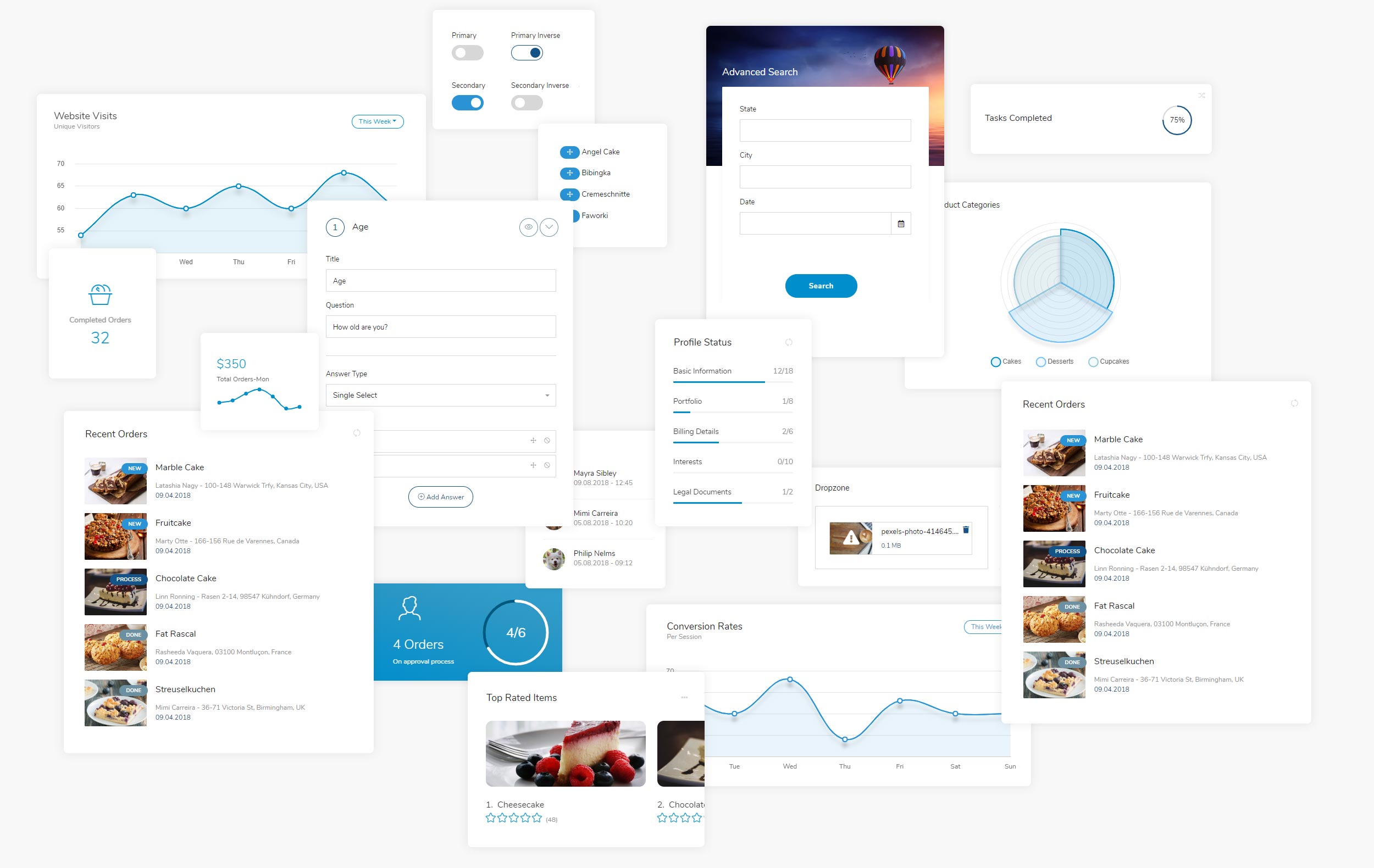
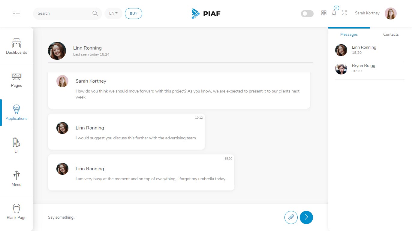
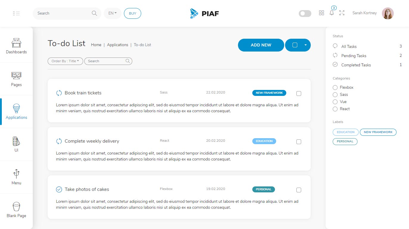
Applications
With the help of components and layouts, we created four different applications. They are a good way to get you started if you want to build something similar.
Themes
We carefully choosed colors and created 10 different themes with dark and light versions. You may also create your own themes easily since all the theme related styling is managed by Sass variables.
Navy Blue
Olympic Blue
Yale Blue
Moss Green
Lime Green
Carrot Orange
Ruby Red
Monster Purple
Steel Grey
Granola Yellow
Enjoying so Far?
Purchase Piaf to get a fresh start with your new project.